

ROKT
As Rokt NY’s sole UX researcher and designer, my work focused on optimizing the end-users experience in interacting with Rokt’s ad placements across various partnering websites during their transaction journey. My contribution in research, experimentation and designs directly resulted in higher Value Per Transaction (VPT) and greater Lifetime Value (LTV) for our partners customers. My work also provided insight across the company as to our users’ attitudes towards online ad placements, and how, through purposeful design, we could provide a more valuable, enriching and appreciated experience for users.
Year
2021
Role
User Research
Visual Design
Interaction Design
Devices
Mobile
Desktop
E-Commerce AD-Tech
Rokt is a B2B e-commerce marketing technology that utilizes machine learning to target users at different touch points of their online purchase journey. Rokt’s mission aims to increase customers' Lifetime Value (LTV) by capturing their attention during a vulnerable moment in their purchase flow, a crucial moment the company has coined as the customer’s “Transaction Moment.”
My work focused on researching general users’ behaviors during their online shopping experience and their overall attitude to ads throughout their purchase journey. This research informed key design decisions that resulted in higher Value Per Transaction (VPT) amongst Rokt’s targeted users.

PHASE I
Discovery
-
It all begins with an idea. Maybe you want to launch a business. Maybe you want to turn a hobby into something more. Or maybe you have a creative project to share with the world.
-
Wanting to get a clearer picture of the users’ current journey and potential bottlenecks, I took a look through data that existed within the company. I used existing Tableau reports and worked closely with Business Analytics team to create reports that could inform my team’s KPIs. For example, an invaluable insight from this audit informed my team’s lever to lower the amount of clicks it would take a user to understand and claim an offer during a purchase.
-
Based on what I understood of the users from the key stakeholders in the business and existing data about users activities/behaviors, I began to form assumptions that would create a launchpoint for further research and experimentation.
-
I surveyed and screened over 100 users to interview 50 regarding their general experience shopping online and encountering ads in their journey. These interviews consisted of questions to probe users about their experience while going through actual websites they enjoy shopping on, so that their feedback could be more authentic and less staged. These interviews/tests were conducted remotely during the pandemic.
The challenge
The e-commerce ad-tech space is dynamic, changing its approach and content constantly from one moment to the next based on user data. In speaking directly with users, and walking through a few typical websites featuring ads, I learned quickly that users are consciously and subconsciously averse to advertisements, and skilled in avoiding them at all costs despite how relevant the ads might be to the user. This posed as a large challenge in my discovery since the task at hand was to continue designing ad placements under the assumption users were interested in relevant advertisements.
However, this assumption was certainly false according to first-hand accounts from our users. It became clear that overtime users become hyper-attuned to ad placements, and how to avoid them.
Company’s KPI: Increase Lifetime Value (LTV) of current customers for our brand partners.
To do so…we needed to increase:
Value Per Transaction - what are the users buying and the average spend? Is there a way to increase this number and at the same time increase the customer’s LTV?

Phase II
Experimentation and Design Variants
-
34
Designs
-
200+
User Tests
-
7
Ad Verticals
UX Metrics to Determine Success in Experimentation
-
⏱ Time on Task
Compared to current benchmarks, we wanted to learn the amount of time spent on each task throughout the users purchase journey, from product selection to order confirmation. Prolonged processes affect UX negatively.
-
🚫 User Errors
During a given task, we wanted to document the number of error opportunities to understand the heuristics of our ad designs. Depending on the frequency and type of errors, we evaluated the UX and usability of a potential ad design in our experiments
-
🏄♂️ Navigation
In creating desired user flows for customers, we had to consider edge cases that allowed them to navigate to and out of ad experiences. The goal was never to take away from the shopper’s experience, and so our designs always featured navigation tasks.
-
🤝 Credibility
This was a surprisingly powerful metric for me in creating designs. Users spoke at length to seeing advertisements as scams, so it was a delicate balance creating more ads for users that they would actually enjoy engaging with. In our experiments, we probed users to speak to us about their perceptions of the ad, if there were and constraints given their look/brand association to validate trust.
-
🤩 Customer Satisfaction
At the onset of our user testing, we devoted a section in our follow-up questions that surrounded the users satisfaction not only interacting with the ad, but seeing gate ad on a partner’s website. Questions included whether the users trusted the ad on the partners website, did it take away from the value of their purchase or add to their experience as whole.
-
✅ Task Success Rate
Of course, overall we wanted to determine when a user engages with an app, can they successful opt-in/opt-out to complete the success flow for a user interacting with one of Rokt’s ad placements. This relief not only on the design, but the placement on the page and in the flow as well.

“Observe what people do, not what they say”
— ‘Design like a Scientist’ by Navin Iyengar, Product Design at Netflix
Alongside extensive secondary research, including best practice design principles in ad tech and competitive market analysis to understand what the best in class ad-tech companies have accomplished already, I began to create new designs for our partners to test and generate direct user feedback. These design tests help prove/disprove many hypotheses our team had around our users wants/needs/behaviors, and better informed design decisions based on real user feedback.
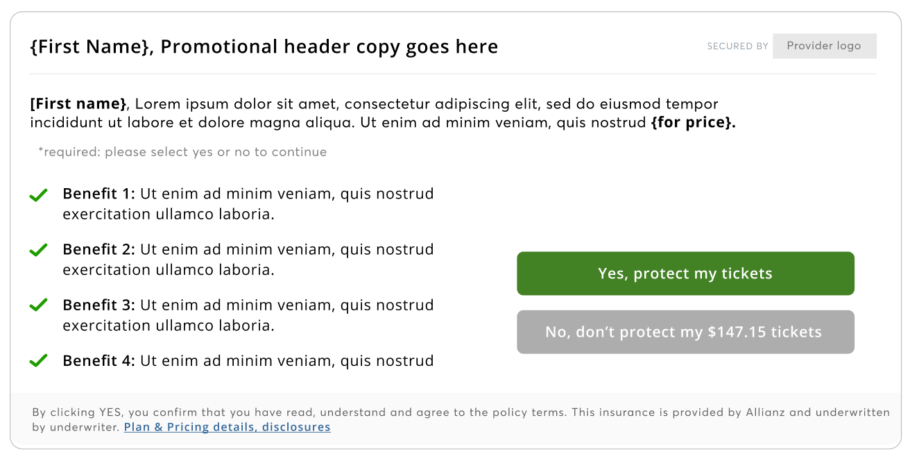
Insurance Vertical
Testing hyper-personalization
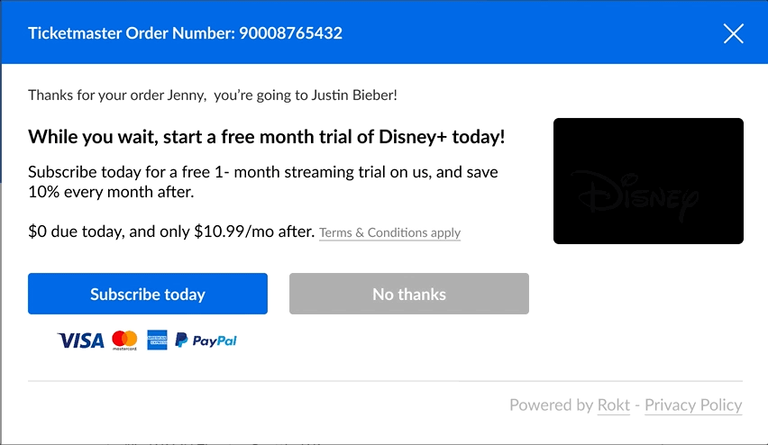
One hypothesis featured in this design example: Personalizing the experience with the users name will result in higher engagement with ads from users.
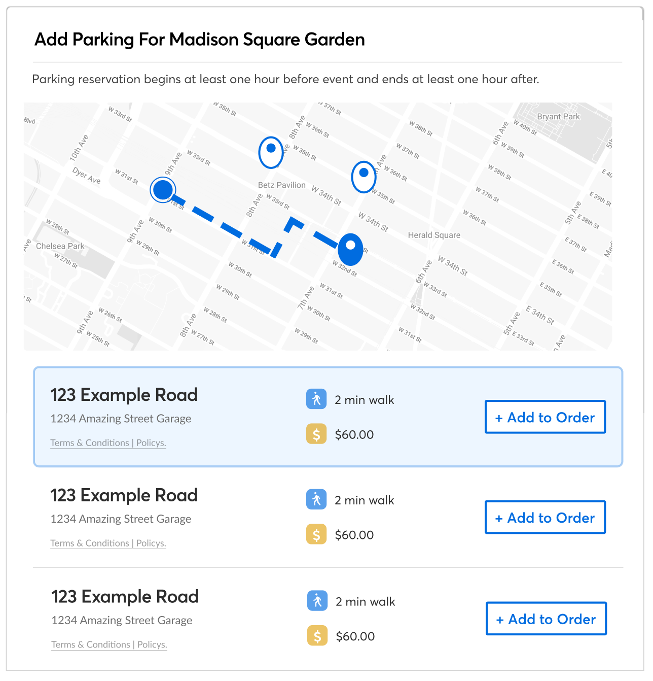
Events/Parking Vertical
Testing visual guides and added data points
One hypothesis featured in this design example: Adding visual aids (map view) and what we assumed could be helpful data points, users would be able to make a more informed and quick decision based on comparison
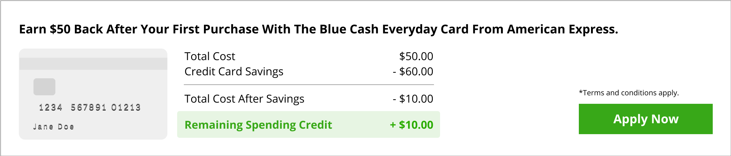
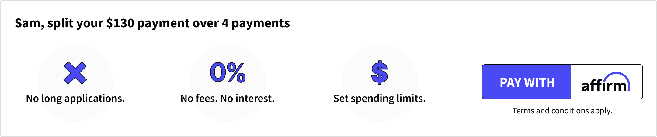
Financing / Credit Cards and BNPL (buy now pay later)
Positive reinforcements to visualize offer
One hypothesis featured in this design example: If we offer less explanatory text and instead visualize the offer for users, we will see higher click-rate
Design Experiments
Coupled with user surveys, ethnographic research and user testing, we began to generate hypotheses to test our learnings to understand what users actually wanted from their ad experiences.
Why experiment?
Testing our ideas can save a lot of time to design and ship a product that could potentially fail. Experimenting (A/B testing & Multivariate testing) allows us to know with higher certaininty what has actual impact on customer satisfaction.
I drafted 5+ variants accross every ad vertical (credit cards, insurance, gift card, etc.) to guage users reactions and test a few hypotheses.

Key projects
Geek out with me
Lean UX Canvas Kick-off
“We need to be able to take the design decisions away from the powerful person in the room and give it back to the users”
Aligning on Shared Goals (Business meets UX)
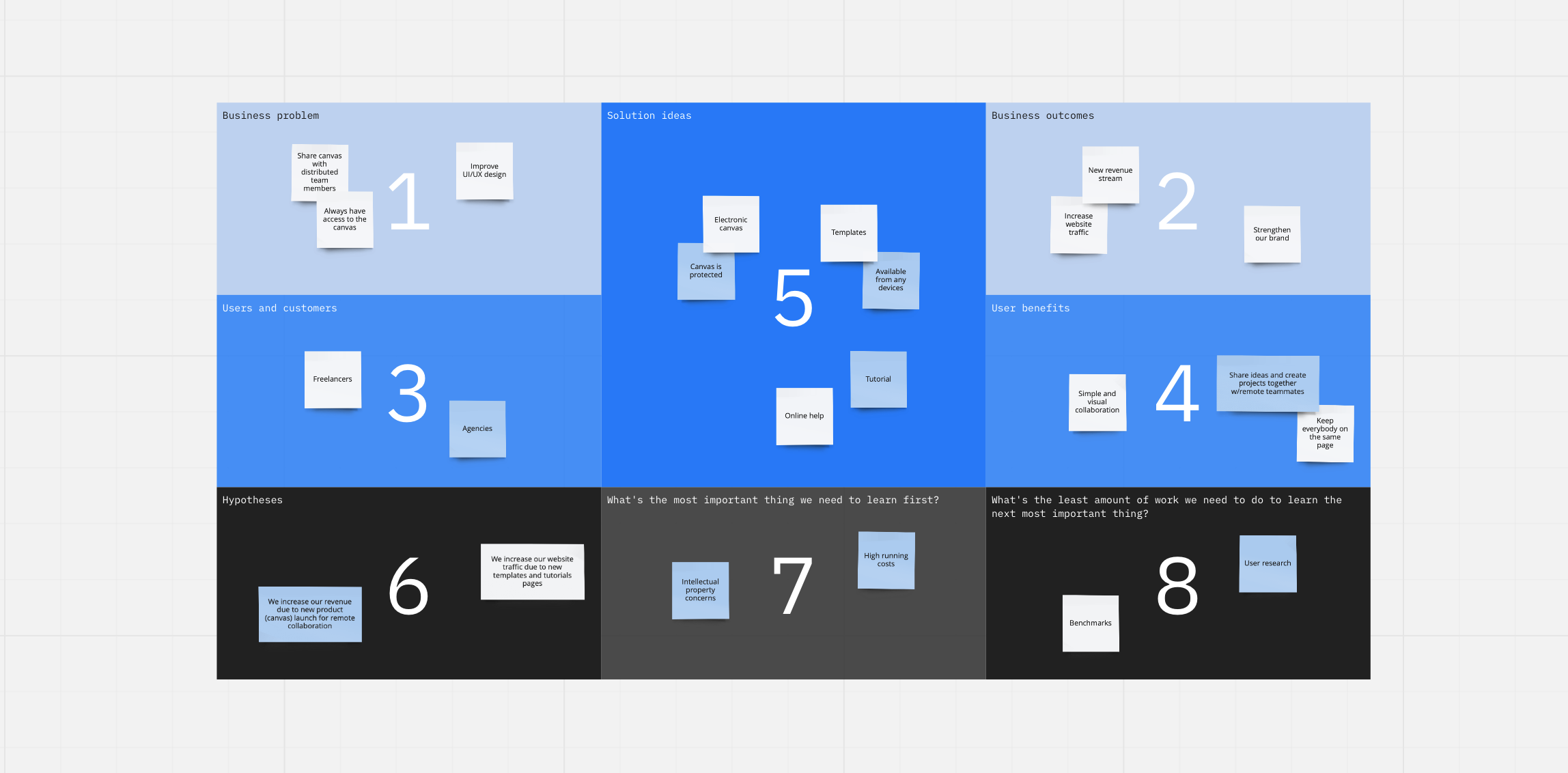
To kick-off research and have all stakeholder invested in the success of these new designs, I lead a Lean UX Canvas exercise consisting of key stakeholders from different teams in Product, Customer Success, Account Management, Business Analytics and Leadership to better understand what we understood about our users, the “business problem” we currently faced, and what we would want to learn from our assumptions. This exercise was paramount in focusing different decision makers ideas into one place, which allowed our team to leave the exercise with not only a clear next step, but next phases of experimentation as well.
Emerging Problem Statement:
How might we design alluring and actionable ad experiences within the users purchase journey without interrupting their purchase flow and contributes positively to the users experience across multiple brands?
Concept Testing
Stakeholder buy-in from the beginning of UX frontier was crucial, and lended itself to unexpected perks, such as more autnonomy on new design hypotheses for our partners. Partners who knew about our research relied on our expertise to define new opportunities for their ad space.
One in particular I enjoyed testing and learning from was animated ads. Based on my experience in the ad-tech space, I learned a lot about what attracted the usrs eye despite their aversion to advertisements. One being the strength of movement and its affect on user behavior.
Alternative Payment Methods
We listened to our users and learned that a large percentage would be more inclined to complete a purchase if they were offered options for alternative pay. We then partnered with

Project LEarnings
What I’m taking with me…
Advocate For Your USers
Advocation: UX for the users was fairly new to the New York branch, whose main focus was satisfying partners needs. Including stakeholders in more UX workshops and design sessions helped them understand that satisfying the end-users needs in turn would contribute to the company’s bottom line.
Failed experiments does not mean failure: In fact, it should be looked at as success. Running design tests and disproving theories means you can learn faster what works with users before expending time/resources/budget.