

Swift Shift
Cross platform SaaS helping hospitals, agencies and caregivers staff home health care cases.
Year
2020
Role
User Research
Visual Design
Interaction Design
Devices
Mobile
Desktop
Tablet
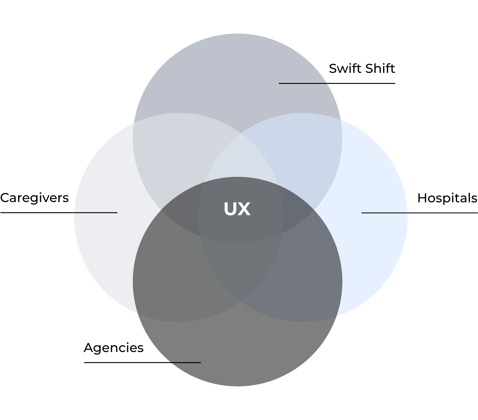
Home Health Care Staffing
The home health care staffing industry has long withstood the test of time, but with the growing demand for technological advance and superb user experience, its old methods of success have begun to fall short. As a multi-faceted system with participation from hospitals, agencies, caregivers and patients, home health care staffing falls further and further behind its competitors in the staffing space.
After extensive user research, our team identified the source of the growing issues in home health care staffing: We found that hospitals operate at 120% capacity, resulting in fewer beds for incoming patients who need care and an over-extended schedule for hospital employees. Additionally, agencies, who have, until now, provided home health care staff for these patients, often reject new cases in order to boost their own success rates.
Concurrently, with the current shortage of home health care nurses and caregivers, patients find themselves waiting in hospitals long after their discharge date. We found that with the staffing shortage and caregivers’ limited access to new opportunities, patient delayed discharge and readmission rates are higher than ever.
Thus home health care staffing suffers from its cyclical dependence on all parties involved.
In this role…
As sole researcher and designer, I built the mobile, desktop and tablet platforms from the ground up, using primary and secondary research as guides. Some of the main methods of research used in this process were strategic planning, stakeholder interviews, design studios, feature prioritization, empathy mapping, user journeys, story boarding, user surveys/subsequent interviews, ethnographic research, affinity mapping, persona creations, interaction/UI design, user testing & continuous iterations.
The process
My process is different in every project and is determined by many factors such as the project goals, business needs, complexity of the problem, time, etc. Here, I will show you how I approached this particular problem and what tools I decided to use.


Phase I
Research

REACHING THE USERS
At the outset, I needed a clearer picture of our users, and after reviewing our quantitative data, I sought qualitative data to supplement some of the information we had.
I sat down with our users to better understand how caregivers and agencies in the field currently work.
Research tools

4 discussion guides
Once the users were identified, I created a discussion guide that would allow all stakeholders to have part in the interviews.

affinity mapping
After over 20 user interviews, I had a lot of information to sift through. Affinity mapping helped transform these interviews into data.

100+ User Surveys
I then created user surveys to gauge our audience of users and find those who fit the criteria I created for testing.

rainbow synthesis
I used rainbow synthesis to quantify patterns amongst our users, learning more from their aggregated behaviors.

20+ User Interviews
Myself and another coworker sat down with users and asked them to tell us stories and draw pictures of their experiences.

Empathy/journey maps
This tool helped both myself and stakeholders truly understand our users behaviors while using the Swift Shift app.

7 Personas
These were used repetitively throughout the design process, to always direct product decisions towards benefitting our users.

30+ Prototypes
I created various prototypes to test ideas from both our stakeholders’ and users’ feedback.
Clarifying Objectives
How might we help caregivers across various disciplines find work in home healthcare utilizing home care agencies and hospitals as a resource to generate attractive opportunities.
For the hospitals:
How might we create a better, more accountable process in providing patients with proper home care that will reduce readmission rates for hospitals and provide patients with caregivers that can properly care for them.
⚡️Issue: Not being able to discharge patients home when they are ready due to minimal - no at home care plan
For the caregivers:
How might we attract nurses and caregivers to home health care cases based on their preferences and needs.
⚡️Issue: Finding work to meet their monetary goals that fit with their schedules
For the agencies:
How might we provide agencies with the right information to conduct their processes of recruiting, hiring and scheduling caregivers to home health care cases.
⚡️Issue: Day-to-day staffing operations and quality of staff

Phase II
Planning and Design

Feature PRIORITY Matrix
I was constantly inundated with new ideas of how to create “the next best thing.” It became a struggle to pick out which features take priority. Creating a Feature Priority Matrix allowed everyone to focus on what would take priority each sprint.
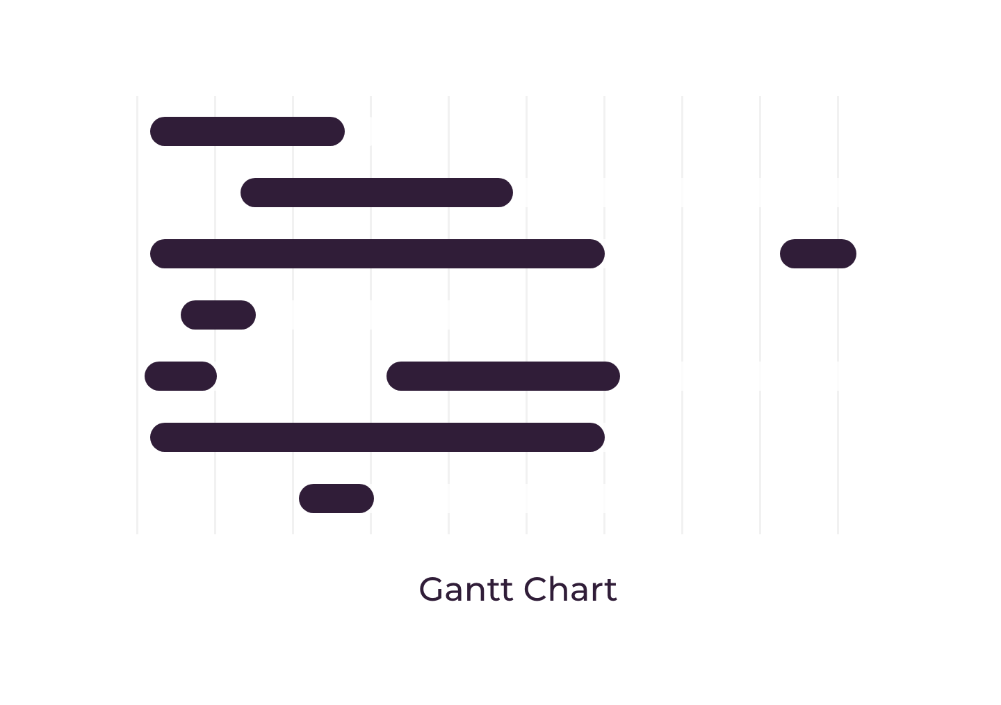
Gantt chart
Gantt charts are used for planning projects of all sizes and they are a useful way of showing what work is scheduled to be done on a specific day. With so many different teams, a gantt chart was useful for me and other parties involved to manage design expectations.
Sketches & Wireframes
The first step in the design process is to rapidly create concept designs that could satisfy the problem statements, user feedback and of course, the business requirements. For each design task, I began by collaborating with relevant stakeholders to make sure we understood requirements and focused our efforts on the end users. Together, we drew up concepts that captured all of our different expertise. These concept designs were then taken to low-fidelity wireframes, which would eventually, through iterations and testing, become high fidelity clickable prototypes.
Prototyping & Testing
After iterative designs in low - medium fidelity, I created a high fidelity mock-up that functioned almost like an actual app. The clickable prototype included animations and graphics to further actualize the experience, so that when users sat down with me to test the product, I was getting feedback on designs that were one step closer to the final experience.
How did we know we were successful?
-
Monthly Active Users (MAU)
Over the course of the months, we would analyze new users, where they came from, and their journeys through the app to learn their behaviors.
-
User Abandonment
Alongside a recruiting funnel, we monitored users from onboarding to application submission. We followed their paths and identified areas of friction based on abandonment of task after certain level of commitment.
-
Time On Task
I learned directly from users that Swift Shift was primarily used to find supplemental work, and therefore was used for two main user journeys: looking for new work and applying to new opportunities to fit their needs. Time on task was crucial to make sure the users needs were met timely and efficiently.

Key projects
A look at some cool projects I got to work on…
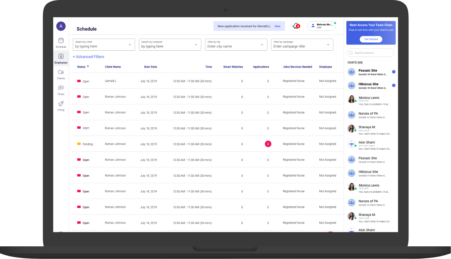
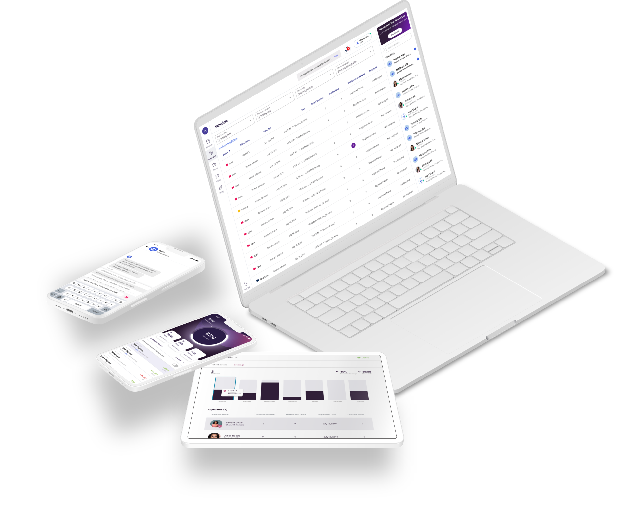
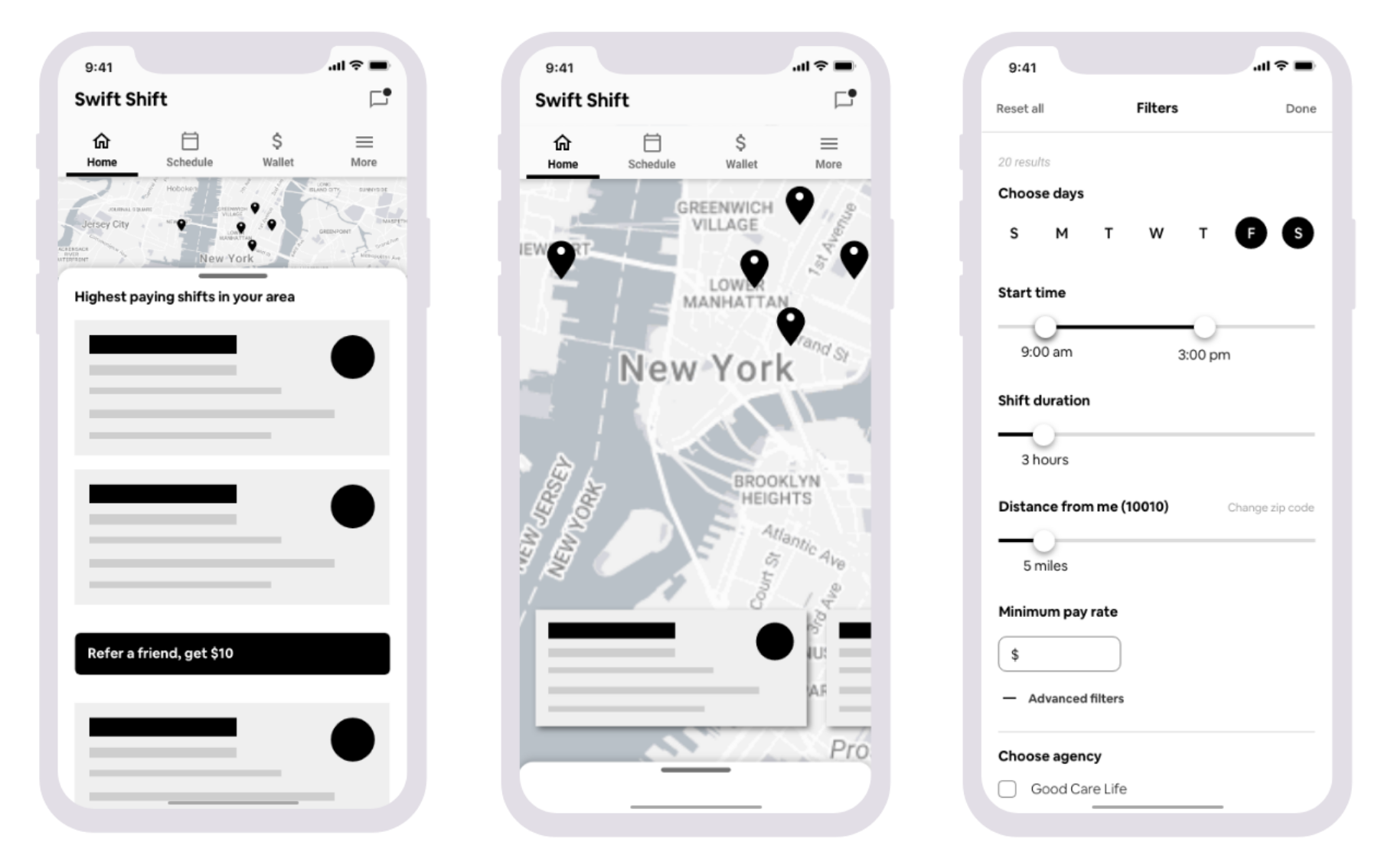
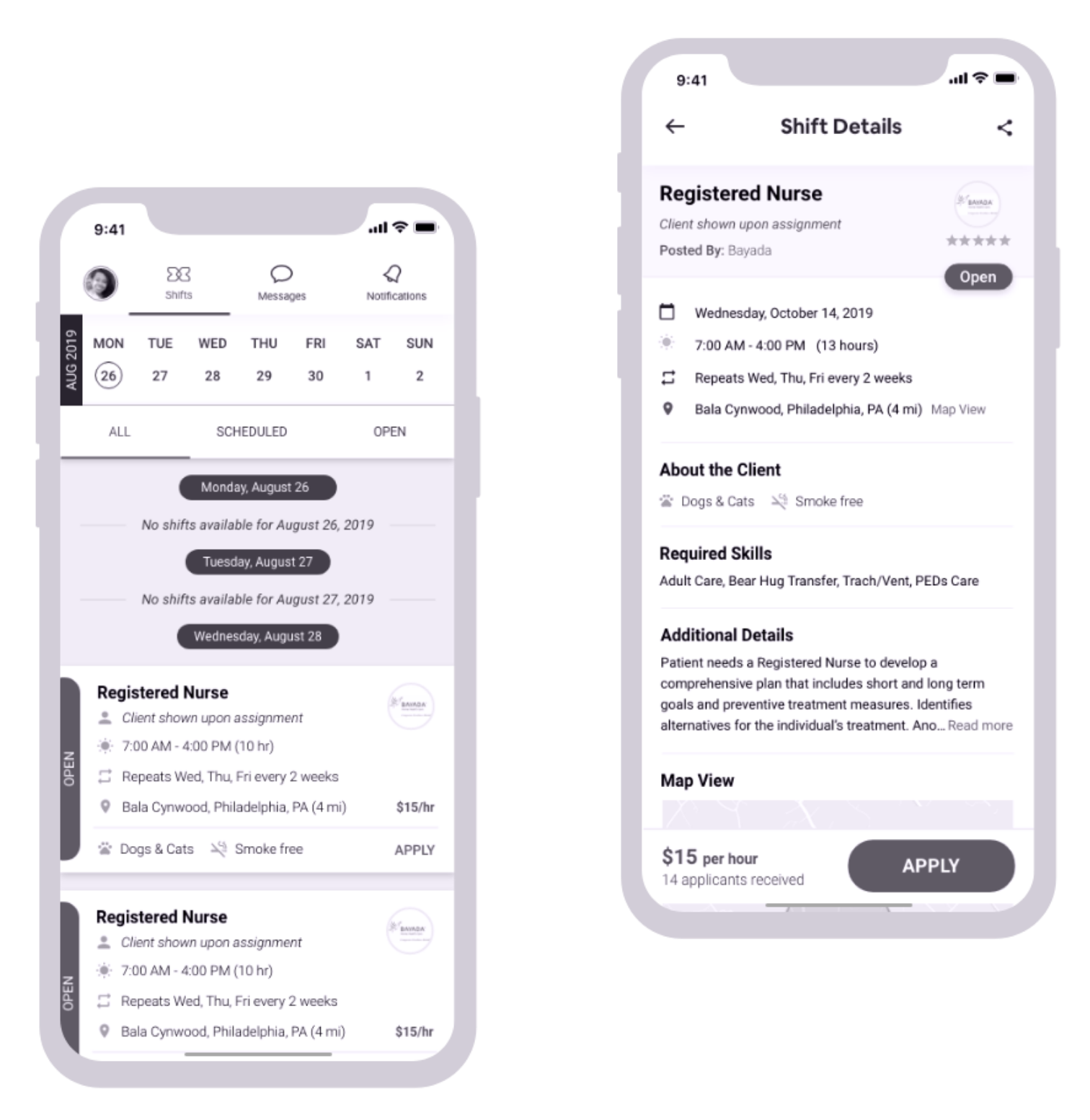
Desktop Recruiting Platform
Though our model depended solely on the UX metrics of our healthcare users, our primary goal as a business was to replace the recruiting process as it stands today entirely. This would allow Swift Shift to own the process from patient release to in home care and the longevity of their care at home. To do this, we needed to learn how the staffing agencies worked, what was important to them in a Dashboard view, and how they managed constantly fluctuating teams.
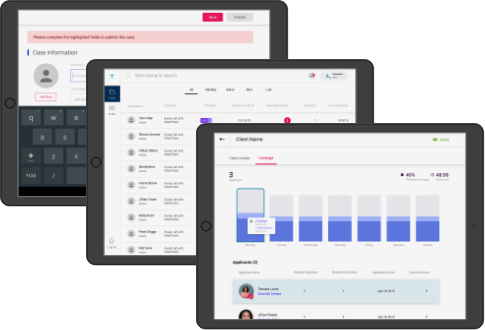
TCM Portal - Tablet
In efforts to bridge the gap in the industry between hospitals and caregivers, we created an app that would service the Transitional Care Managers responsible for finding care for patients ready to be discharged. High readmission rates, extra cost and poor staffing, as we discovered, was due to agency being the bottleneck in the staffing process.
Thus, we created a tablet portal where patients could bypass the agencies and staff their own cases themselves.
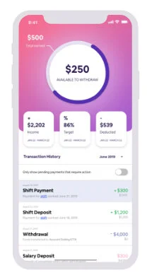
“Swiftpay”
Satisfying both a business and user need, I created concept designs for Swiftpay, a same-day payment tool that would allow field staff to withdraw their earnings the same day they work.
Field staff would often lament over the debt they accrued because of the wait time between pay checks. The money that was theirs was not accessible when they needed it. However, after each complaint, they would simply reason, “that is how this industry has always been.” It was this sentiment exactly that prompted our team to create a solution to a problem our users never thought could be solved.
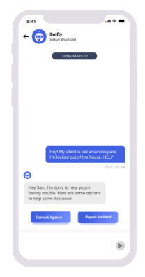
Bot (AI) Assistance
There are a lot of complexities that we simplified and made more efficient through Swift Shift. However, we are not naive to think users will not run into questions or issues along the way. Thus, we designed and created “Swifty Bot,” an AI chat bot assistant, to help users with common questions. Swifty Bot would allow for quick answers in case a representative at Swift Shift could not assist them immediately. I did my own research in microcopy and AI interaction design to make sure users were aware of and comfortable talking to Swifty.
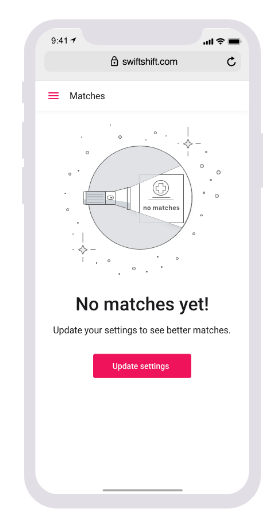
State screens
To account for every user journey, not only the users’ happy path, I created various screen states ranging from “empty state” to “no content” screens.
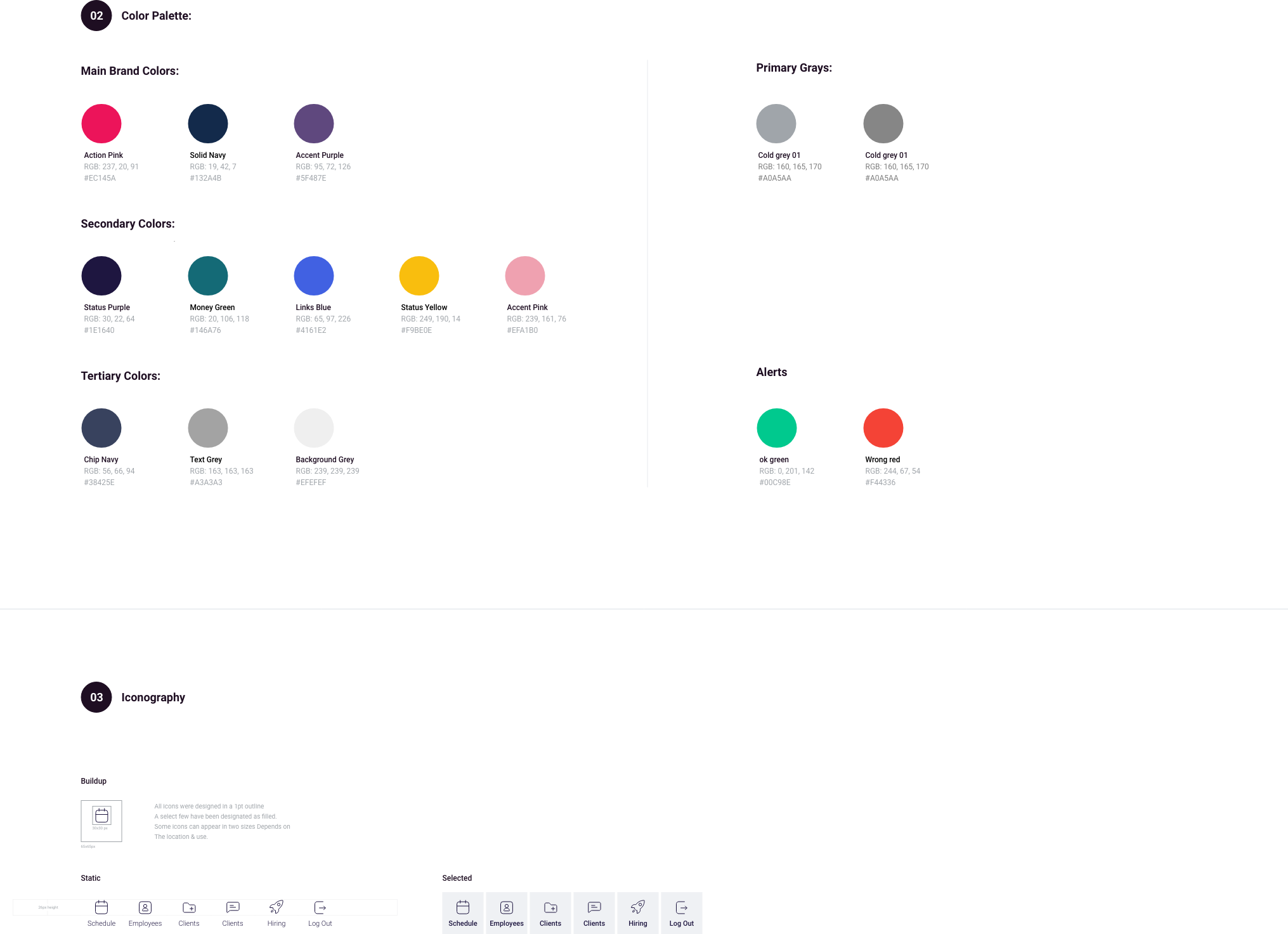
Design LAnguage System
Satisfying both a business and user need, I created concept designs for Swiftpay, a same-day payment tool that would allow field staff to withdraw their earnings the same day they work.
Field staff would often lament over the debt they accrued because of the wait time between pay checks. The money that was theirs was not accessible when they needed it. However, after each complaint, they would simply reason, “that is how this industry has always been.” It was this sentiment exactly that prompted our team to create a solution to a problem our users never thought could be solved.
The final designs
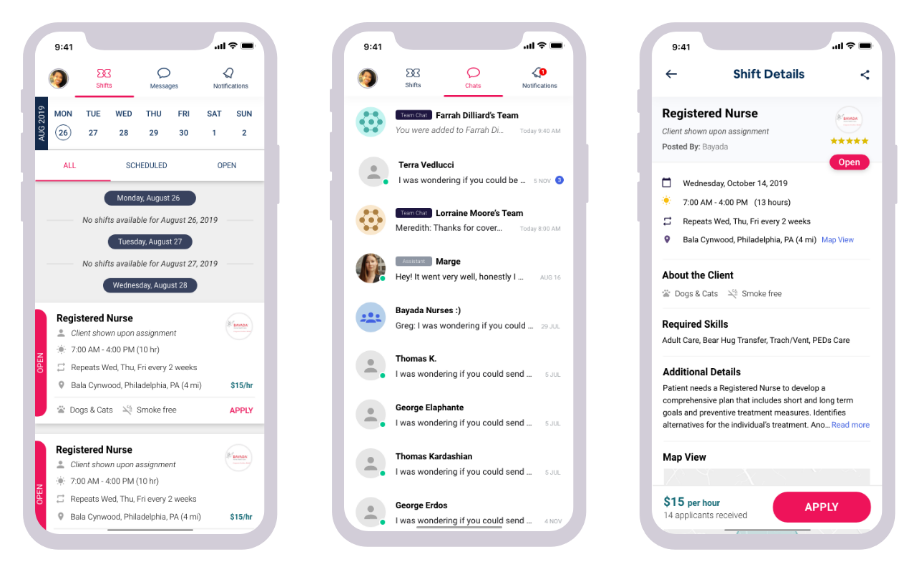
The final designs reflect feedback from users through user research and testings.
Much of their feedback had to do with information hierarchy and what data points were most valuable to them in looking for work. Through several iterations and consequent data analysis, I was able to create a version of the app that was most useful, usable and valuable to our users, satisfying all areas of heuristics.
Due to NDA, the prototype below reflects a conceptual version of Swift Shift that is not deployed.

Project LEarnings
What I’m taking with me…
Stick to process
Stick to process: There were many times that other teams at Swift Shift had ideas for improving the product. However, a lot of these ideas were not validated, and although they expected change overnight, I needed to remind them and myself that there is a process in place to ensure new ideas should be validated before investing time and design effort.
Fail fast and learn faster: There is no progress in design if you do not learn from your failures. In all my failures, I learned to be more diligent in both my research and design efforts.
Document everything: As a researcher, I get excited when I speak to users and begin to draw out incredible insights from conversations. In every interview and test, I made sure there was a notetaker and proper documentation to validate all new insights and learnings.